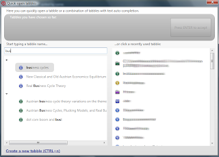
 Let's talk about the ALT+c dialog box (aka quick-open tabbles) (see the above picture). This is one of the most important features in tabbles, one which increases your productivity a lot.
A user complained (hi nefycee!) of the new appearance of this dialog box. Now that categories are gone, in the left panel you only see a list of colors (until you type something). So he does not know what color to pick to reach the tabble he has in mind. Isn't this the same problem I described with categories (i.e. having to click an intermediate concept before clicking the concept you want), just made worse?
This would be true, if that were the way the quick-open dialog box is meant to be used. But it is not so. The dialog is meant to be used as follows:
- type the first letter (or the first few letters) of the tabble you have in mind. (Then the auto-completion list comes up). then
- press down-arrow until you highlight the tabble you desire; then
- press ENTER to add the tabble to the list of tabbles-to-be-combined.
- Repeat the above procedure to select another tabble, or press ENTER to open the combination you have composed.
__
I see some possible objections to this way of working:
1. What if I don't like typing? I mean, what if I can't be bothered to type one letter? Well, if you have recently used the tabble you are looking for, you can find it in the recent list (the list to the right in the picture). So you don't need to type a letter in this case.
What if I don't like typing and I haven't used the tabble I am looking for in a long time? But this, by definition, happens rarely. It's ok if you rarely have to type one letter.
(I am also considering grouping tabbles by first letter when you haven't typed any letter; so you can click the first letter. But I am not sure this is needed and I am afraid it could be misleading, leading the user to think the preffered way to use the dialog box is to click around.)
2. What if I don't know the name of the tabble I am looking for, so I don't know what letter to type? Well, but this means you don't have any specific tabble in mind, that is, you are just browsing. But then you shouldn't be using this dialog in the first place. :) This is called the "quick-open" dialog, after all. You use it when you want to open a tabble (or a combination) that you already have in mind.
__
So I don't see meaningful objections, once you understand how the quick-open dialog is meant to be used. (If you disagree, please let me know.)
But a question remains: why was nefycee under the impression that the dialog was meant to be used in a different way from what I described above? Probably because the fact that you see the colors (until you type anything) is misleading. This is true, and I think it should be changed, but I haven't had time yet. I think it would be better if, when you haven't typed any letter, you saw a flat list of tabbles, ordered by name (maybe grouped by first letter?).


hi Maurizio !
RispondiElimina