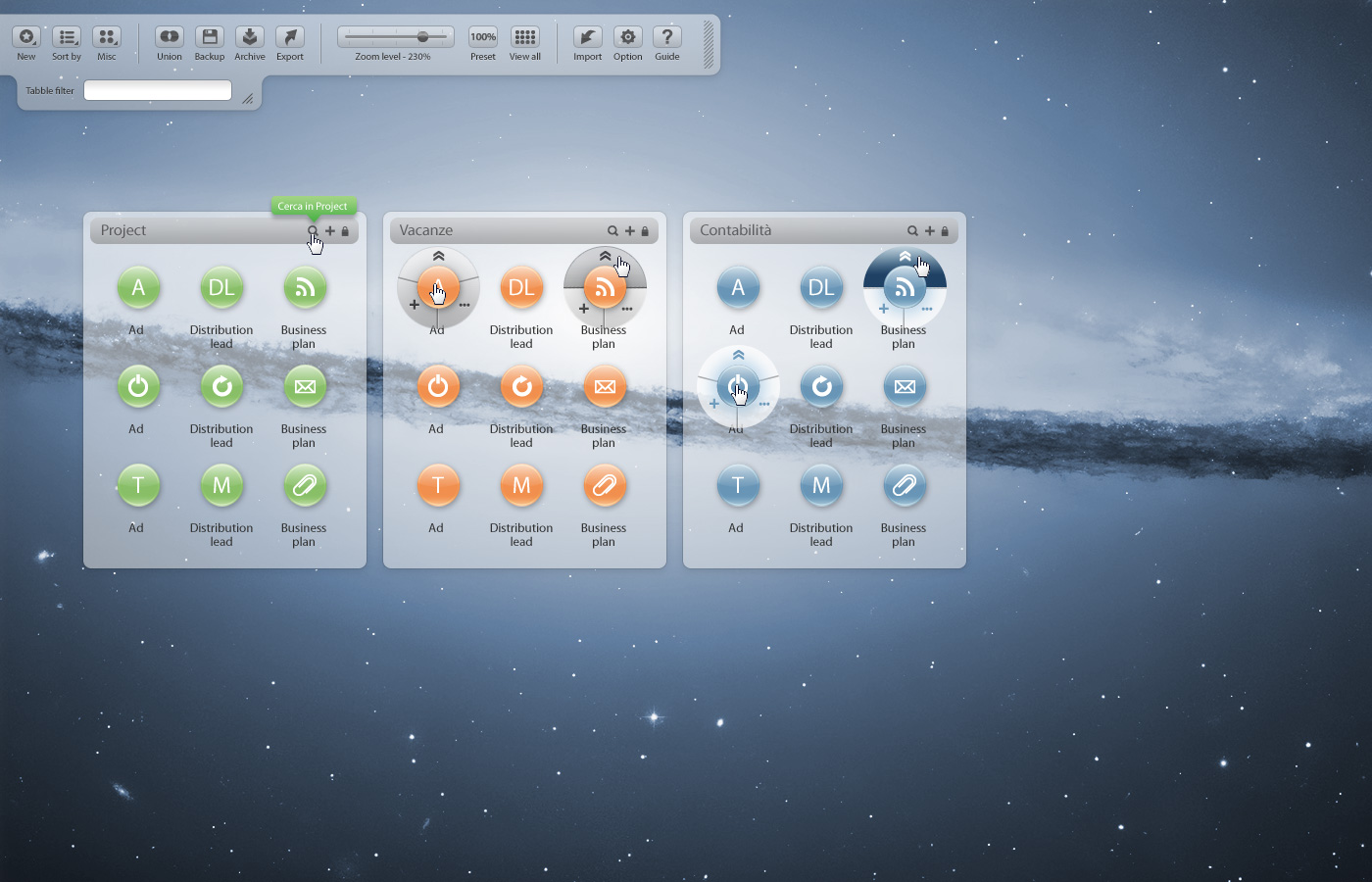
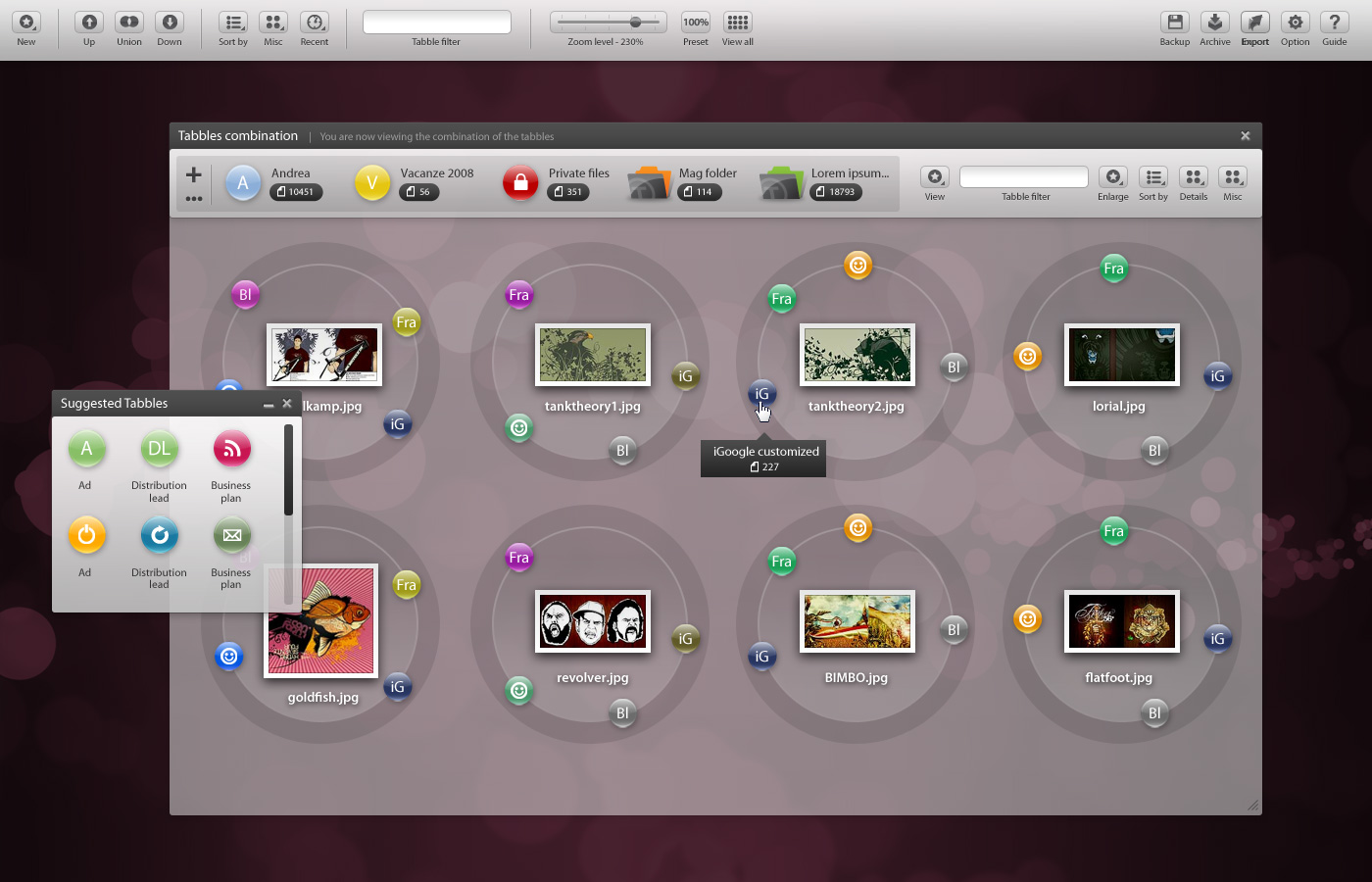
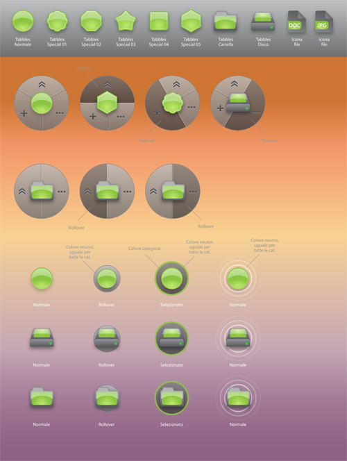
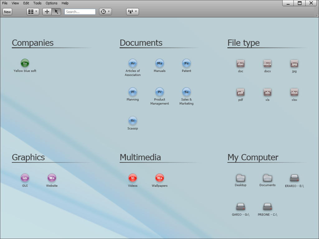
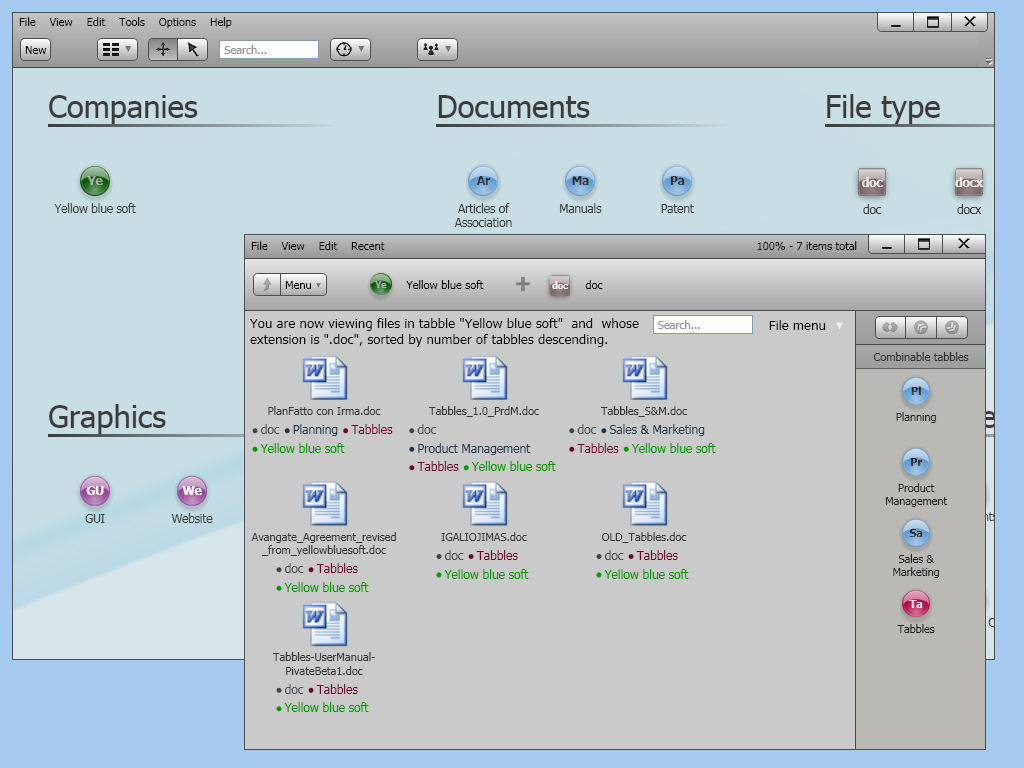
Tabbles' new face:
Visualizzazione post con etichetta tabbles. Mostra tutti i post
domenica 31 gennaio 2010
1.4.5 -> the BIG release
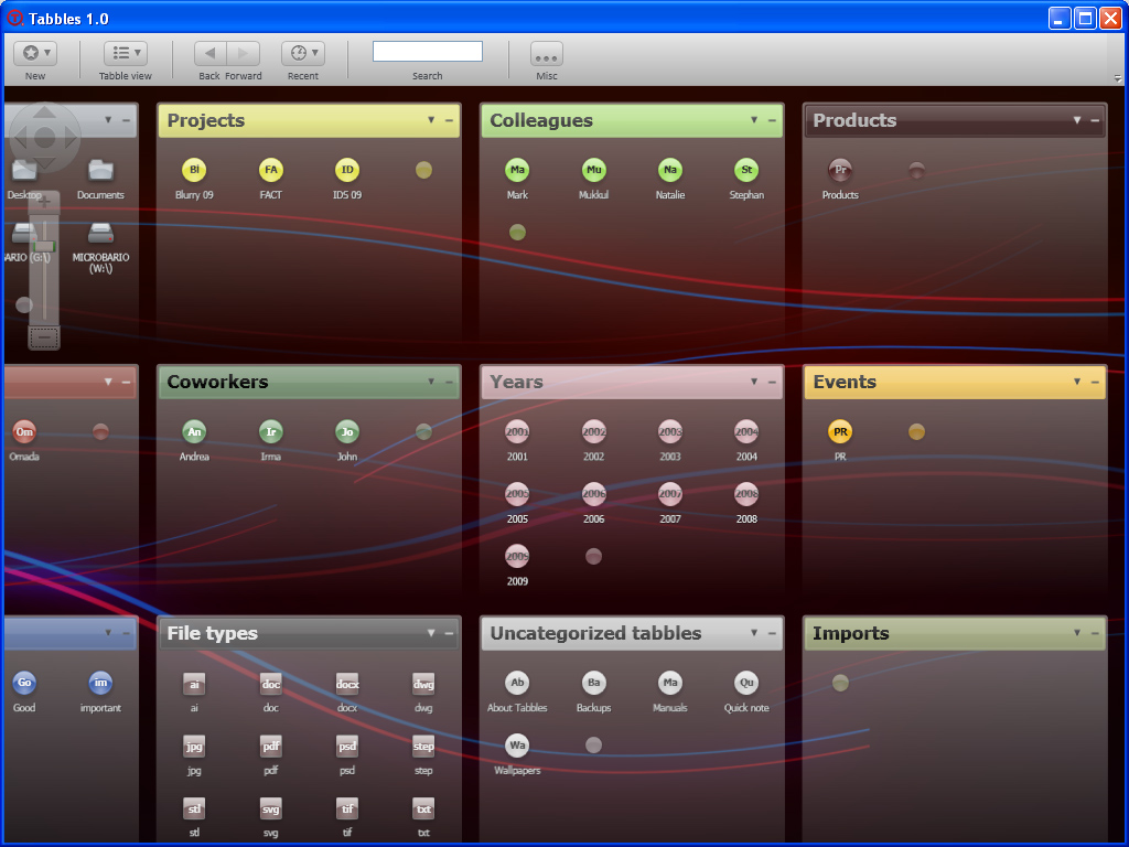
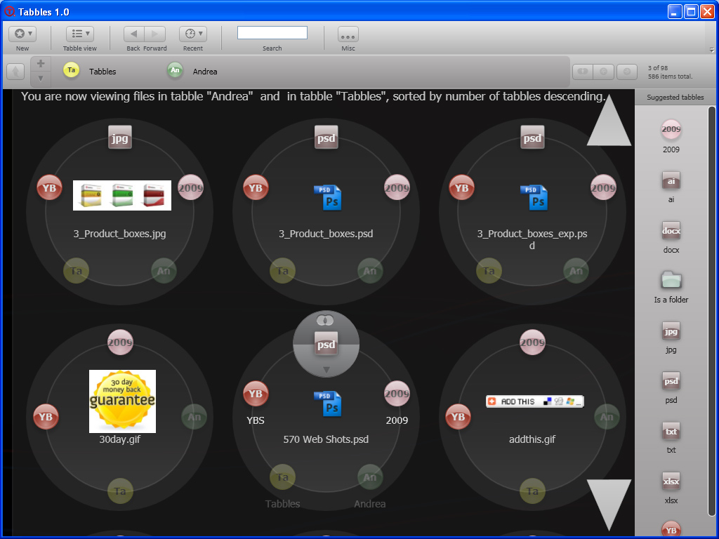
Ladies and gentleman, we've just redesigned Tabbles, from scratch - or nearly. This release is the result of the 6 months of testing, discussing, improving, re-testing, re-thinking, re-designing. Now Tabbles looks like something "familiar" and not anymore like an alien kind of application. We hope you'll love using it as much as we loved making it.
venerdì 15 gennaio 2010
1.4.5 beta1 -> beta2 -> beta3 ->RC1: the biggest release we did in a while
HELLO WORLD,
If you thought that Tabbles is complicated to use, this release should make you change your mind. Now it really looks like Windows Explorer Evolved :-D
Check the whole story on our forum or download the beta here.
1.4.5 beta2 --->Ooops, we did it again! Check our forum or download the beta here.
If you thought that Tabbles is complicated to use, this release should make you change your mind. Now it really looks like Windows Explorer Evolved :-D
Check the whole story on our forum or download the beta here.
A little teaser (1.4.5 beta1):
1.4.5 beta2 --->Ooops, we did it again! Check our forum or download the beta here.
One more little teaser (1.4.5 beta2)
domenica 10 gennaio 2010
we got a nice review on a paper mag! :-)
HELLO WORLD, and specially Italy this time :-)
I guess that bragging about a nice review on our blog is a bit lame, but since it's the first paper review we get, it's a bit of a special moment and needs to be celebrated :-)
Plus, I keep a collection of all the Tabbles appearances on delicious (also accessible from our OPML), and I needed to scan the page and put it somewhere in order to keep the record.
The review is in italian, from the pcmagazine...and we got an 85%! Here you go:
P.S.: we just reached 100 users and 1000 posts on our forum! :-D
martedì 15 dicembre 2009
The evolution of a GUI and the pulsating life of a UX
________________________________________________________
We moved our blog to:
http://tabbles.net/blog
You can read this post here,
and subscribe to the RSS
________________________________________________________
Hello world.
In the beginning it was chaos.
Initially we had many different ideas, a lot of confusion in our heads and one goal: "be revolutionary user-friendly => be different from everything else".
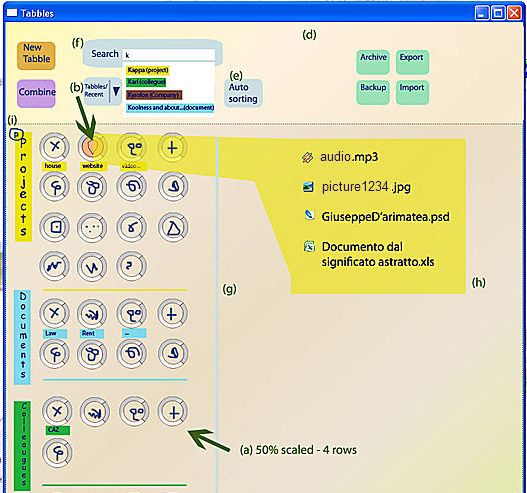
This is a very first mockup done by me on a cold scandinavian night in December 2008:
One more mockup, done in another freezing scandinavian nuight, one month later:
Then came ZUI, direct manipulation, vector graphics and Utopia.
At this point we were heavily focusing on ZUI, and vector graphics. Most of the graphics (including the button icons!) was vectorial and done in XAML. Why made that choice, is not 100% clear to us yet :-)
...a few mockups later...
...Tabbles started to get its identity. While I'm writing this post, I'm looking at the app on my screen and you might say that the following shots do not look at all like what we have now. Well, it looks different but some key elements where there already: most of the icons with their minimalist design, the grey gradient, the zoom bar, the separation between tabbles level and file level. Plus all the main features such as the zooming+panning paradigm, which was pervasively deployed wherever possible.
Here is one out of many crazy mockups done in the first half of 2009:
This design never made it into development (thank GOD!) as its space-efficiency would have been extremely poor... apart of being plain ugly. This is what Tabbles looked like in those days:
Cool! What's next?
While I'm writing this, we're at 1.3.10 RC1: we're working on an alternative view mode that doesn't require the user to zoom and pan. Else, we're keeping our beloved community informed using this forum post.
The story goes on here
Questions? Comments? They're all very welcome! This is us and this how you can contact us.
P.S.: Marco was kind enough to design a couple of decent logos for us :-)
We moved our blog to:
http://tabbles.net/blog
You can read this post here,
and subscribe to the RSS
________________________________________________________
Hello world.
this is a little illustrated story of how the Tabbles GUI evolved, from paper sketches to the latest version (1.3.10 RC1). For those who don't know, the Tabbles GUI is done using WPF and C# while the core logic is written in F# wherever possible (that excluding the GUI and those time when and old API had to be called in C).
In the beginning it was chaos.
Initially we had many different ideas, a lot of confusion in our heads and one goal: "be revolutionary user-friendly => be different from everything else".
This is a very first mockup done by me on a cold scandinavian night in December 2008:
(Dec. 2008)
And at the same time we sketched a few crazy ideas on paper:(Dec. 2008)
One more mockup, done in another freezing scandinavian nuight, one month later:
(Jan. 2009)
Then came ZUI, direct manipulation, vector graphics and Utopia.
As we started, me and Maurizio we shared a common sense of frustration for the GUIs in general. Most of the software around looks indeed gray, square, boring and it gives the impression that not much happened since the early 90's. On top of it we were disgusted of how they file management hasn't evolved at all since Bill Gates wrote the FAT for the IBM-DOS 1.0 in 1976.
Those are the very first prototypes of Tabbles, which few people has seen (February 2009 until May 2009):
(Feb-March 2009)
At this point we were heavily focusing on ZUI, and vector graphics. Most of the graphics (including the button icons!) was vectorial and done in XAML. Why made that choice, is not 100% clear to us yet :-)
For sure it was painful: the easiest way was designing first Illustrator, then saving to XAML using the Mike Swanson's plugin (very friendly guy, excellent plugin) and then checking the result using kaxaml. Soon we hit the wall and realized we couldn't avoid using Microsoft Expression Blend 2 - not a bad tool itself, but we still needed whether Illustrator or Visual studio to do many different things. I guess we did some true pioneering there...
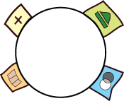
One of the features we were more proud of was the so called "butterfly" (which existed in 3 different shapes until the version 1.1.something and we plan to revive it as undisclosed point).
The purpose of the butterfly was to allow the user to perform operation directly on the object without going through a sub-menu (so called direct manipulation) or using the right-mouse button (widely criticised in the late 80's).
One of the first ones (from January 2009) looked pretty cartoonish:
In February the butterfly looked a lot like an atom (from Illustrator):
One of the features we were more proud of was the so called "butterfly" (which existed in 3 different shapes until the version 1.1.something and we plan to revive it as undisclosed point).
The purpose of the butterfly was to allow the user to perform operation directly on the object without going through a sub-menu (so called direct manipulation) or using the right-mouse button (widely criticised in the late 80's).
One of the first ones (from January 2009) looked pretty cartoonish:
In February the butterfly looked a lot like an atom (from Illustrator):
(Feb. 2009)
Uh, by the way, at that time we also had a temporary logo, we used it for a private beta (targeted to FFF = friends, family and fools) and it looked liked this:
(05 Apr. 2009)
...a few mockups later...
...Tabbles started to get its identity. While I'm writing this post, I'm looking at the app on my screen and you might say that the following shots do not look at all like what we have now. Well, it looks different but some key elements where there already: most of the icons with their minimalist design, the grey gradient, the zoom bar, the separation between tabbles level and file level. Plus all the main features such as the zooming+panning paradigm, which was pervasively deployed wherever possible.
Here is one out of many crazy mockups done in the first half of 2009:
This design never made it into development (thank GOD!) as its space-efficiency would have been extremely poor... apart of being plain ugly. This is what Tabbles looked like in those days:
(April 14)
(May 6-8)
Then a master jedi arrived and showed us the path to the Force.
I have a background as 3D graphician, sales/marketing guy as well as a degree in economics (which didnd't even hang on the wall...). Maurizio has an IT degree and learns programming languages in his spare time (last time I asked he mentioned he knows 20, that was a while ago). Both of us are able to mess around with photoshop: but messing around is one thing, designing a sleak GUI is another.
Being aware of our limits, at some point we asked my younger brother to help us finding a decent designer to design our homepage and to fine-tune our GUI. He initially babbled something like "yeah, hmm, you know...". After a couple of weeks he came out with a statement that sounded like "well, if you want I can get you the best guy in town, but it won't be cheap...". The town was Rome, and the guy was Marco Marini.
Marco lives on a space-ship and he typically hangs around riding a flyng-dragon and wearing a shiny Mithril armor. We met him for the first in February 2009 and showed him what we had at that point. It took him a while to send us a couple of mockups as while he was working for us (pennyless garage-based developers), he was also working - among the others - on the rai.it website (the italian public tv website). He designed our homepage, our logos and re-designed our GUI.
In May we received the first mockups from him of the redesigned GUI....for the next few weeks we simply couldn't stop drooling :
[since we're 3 nice guys investing their own money (!) we got a very friendly price (which I was kindly asked not to disclose) :-) ]
This major upwards shift in the GUI did obviously push us towards new directions. Me and Maurizio would have never been able to produce graphics with this level of care... The new mockup had beautiful 3D effects everywhere, neat shadows, rounded shapes and reflections, definitely a few meters above the best mockups we did ourselves.
The challenge was now going from .psd to WPF!
Plus, the mockups were based on an early version of Tabbles, as things evolved (and they did pretty quickly) most of the buttons in the mockup were doomed to oblivion...
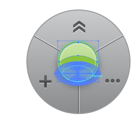
Let's start with the basic: the new tabble + butterfly in illustrator looked like this:
And obviously the XAML that came out of this monster wasn't exactly what Expression blend and Visual Studio were expecting to get... It had to be redone as most of the stuff we got.
But of course we knew that things weren't supposed to be easy and we didn't even consider giving up on the GUI! :-)
Therefore, The next versions of Tabbles looked like this:
1st of August: release-time
Surprisingly for everybody (that is: we, ourselves and us), we made it and released the 1.0 roughly when we scheduled it 1 year earlier, long before the first lines of code were written. Of course 2/3 of the features were missing and the 1/3 that was there would crash as only you'd look at it a bit too intensely... but hey, if Microsoft can do it, why can't we? :-)
The shots of the 1.0 version are still on our website in the screenshots page and the videos are on youtube. Anyway this is what the 1.0 looked like:
Being aware of our limits, at some point we asked my younger brother to help us finding a decent designer to design our homepage and to fine-tune our GUI. He initially babbled something like "yeah, hmm, you know...". After a couple of weeks he came out with a statement that sounded like "well, if you want I can get you the best guy in town, but it won't be cheap...". The town was Rome, and the guy was Marco Marini.
Marco lives on a space-ship and he typically hangs around riding a flyng-dragon and wearing a shiny Mithril armor. We met him for the first in February 2009 and showed him what we had at that point. It took him a while to send us a couple of mockups as while he was working for us (pennyless garage-based developers), he was also working - among the others - on the rai.it website (the italian public tv website). He designed our homepage, our logos and re-designed our GUI.
In May we received the first mockups from him of the redesigned GUI....for the next few weeks we simply couldn't stop drooling :
(The mockups were delivered on 05-07 May 09)
[since we're 3 nice guys investing their own money (!) we got a very friendly price (which I was kindly asked not to disclose) :-) ]
This major upwards shift in the GUI did obviously push us towards new directions. Me and Maurizio would have never been able to produce graphics with this level of care... The new mockup had beautiful 3D effects everywhere, neat shadows, rounded shapes and reflections, definitely a few meters above the best mockups we did ourselves.
The challenge was now going from .psd to WPF!
Plus, the mockups were based on an early version of Tabbles, as things evolved (and they did pretty quickly) most of the buttons in the mockup were doomed to oblivion...
Let's start with the basic: the new tabble + butterfly in illustrator looked like this:
And obviously the XAML that came out of this monster wasn't exactly what Expression blend and Visual Studio were expecting to get... It had to be redone as most of the stuff we got.
But of course we knew that things weren't supposed to be easy and we didn't even consider giving up on the GUI! :-)
Therefore, The next versions of Tabbles looked like this:
(16 June 2009)
(23 July 2009)
1st of August: release-time
Surprisingly for everybody (that is: we, ourselves and us), we made it and released the 1.0 roughly when we scheduled it 1 year earlier, long before the first lines of code were written. Of course 2/3 of the features were missing and the 1/3 that was there would crash as only you'd look at it a bit too intensely... but hey, if Microsoft can do it, why can't we? :-)
The shots of the 1.0 version are still on our website in the screenshots page and the videos are on youtube. Anyway this is what the 1.0 looked like:
(The "ground floor"- 01 Aug 2009)
(The "files' floor"- 01 Aug 2009)
1.1.x -> 1.2.0 -> 1.3.0
Ok, if you look at the first versions of Tabbles, from February and then look at the screenshots up here, you'll probably say "that's quite an improvement!"... sure, but we didn't feel it was good enough.
Many people reported a steep learning curve, had issues with the zooming+panning and was complaining about the poor space efficiency.
We did at some point realize that most of the concepts we introduced in the Tabbles GUI, while sounding smart and correct on paper, where miles away from what the average windows user had learn since the Windows 95 took over the world.
These includes GUI functions as:
- Double click
- Right click opening a context menu
- Standard menu-bar (File, Edit, View, etc).
- Drag'n'drop
Now, did we need one year to find this out? Yes we did: not all we did was wrong and for everything that was indeed wrong we can proudly state that we found 700 things not put in a GUI, which is why I'm writing this post today.
Consequently, between the 1.1.x and the 1.2.0 we did hit on the steering wheel: the goal shifted from "be user-friendly in revolutionary way" to "be user-friendly in the Outlook way".
In November we locked ourselves into our cave and stayed hidden in there for a few weeks, coming out only time to time to show some prototypes to our beloved community.
Among the major improvements in this re-design round were the introduction of a traditional menu bar (you can't imagine how many people were begging for it!), a windowed layout for the file window (revolving a silly decision made long time before), the introduction of drag'n'drop pretty much everywhere, the long awaited explorer integration, a major clean-up of the windows and a much better use of the space with the newborn file window.
The 1.2.0 looked like this:
(11 Nov. 2009)
The 1.2.0 did finally look the way we wanted. Since then graphically not much has changed - the major change was the introduction of the auto-tagging rules (explained here and here) and therefore the correspondent button appeared.
While I'm writing this, we're at 1.3.10 RC1: we're working on an alternative view mode that doesn't require the user to zoom and pan. Else, we're keeping our beloved community informed using this forum post.
The story goes on here
Questions? Comments? They're all very welcome! This is us and this how you can contact us.
P.S.: Marco was kind enough to design a couple of decent logos for us :-)
domenica 29 novembre 2009
space-efficiency -> rearranged file item
HELLO WORLD
Space efficient + readable = not easy task
Being space-efficient is crucial for any application. Not being space efficient results in the app showing less data than what it potentially could, resulting in being less productive. On top of this, you need to make sure that the data is rendered in an easy-to-read manner and there is a whole science behind this.
Cleartype
Maurizio is the expert (read: "the freak") of readability, on several occasions he explained me what is cleartype and why it exist and how it works. Having a pretty good sight I've never been into this stuff, but many people have trouble reading if the font is not big enough. There is a whole bunch of guidelines on how to make good app design, and one universal rule is "don't use text below 12points". Plus, only the system default font is optimized, therefore it's advisable to stick to it and forget about using fancy fonts.
Reading without reading
While Maurizio cares a lot of making sure the text is always readable, I'm a freak of making the text quickly readable. What I mean is that very often within a paragraph or a whole page, one or two words are important and sometimes they're even expressive enough to summarize the whole page. This is particularly important when you have computer generated strings where you know the strings follow a certain pattern and you know you don't need to read the whole thing cause all the information you need is in one word.
In these situations it's important being able to understand how the strings are arranged before even starting to read. Color coding combined with bold text is one way to solve this:
Now, we agree that this window is butt-ugly, but the interesting information stands out of the noise. In the first line you read: blah blah blah blah "xls" blah blah blah blah "Tabbles", "about Tabbles" blah blah. All the blah blahs they're maybe interesting the first time you read them, but once you find out what it's all about, then you just want to skip it and jump to the useful stuff.
Variable length
Being space efficient when the item to be displayed can be of a variable size, adds more spice to the issue. Windows Explorer has the same problem with the file name: it can be very short or very long. The solution that Microsoft opted for is truncating the filename. We have the same problem, along with a much bigger problem which is displaying the tabbles next to the files: the problem is that you can have anything from zero to a lot of tabbles linked to any file, possibly 2 files next to each other have very different amounts of tabbles linked to them. There is no way you can truncate this smartly... the solution we're opting for is to put the tabbles in a sort of tab, and the tab can be shown/hidden, depending on what suits you best in that moment. Smart, isn't it?
What we have today
Finally the screenshot. This is how it looked yesterday.
We're also adding the chance to hide the the tabbles under a file. Here is what it looks like today, next to the Vista's explorer:
Space efficient + readable = not easy task
Being space-efficient is crucial for any application. Not being space efficient results in the app showing less data than what it potentially could, resulting in being less productive. On top of this, you need to make sure that the data is rendered in an easy-to-read manner and there is a whole science behind this.
Cleartype
Maurizio is the expert (read: "the freak") of readability, on several occasions he explained me what is cleartype and why it exist and how it works. Having a pretty good sight I've never been into this stuff, but many people have trouble reading if the font is not big enough. There is a whole bunch of guidelines on how to make good app design, and one universal rule is "don't use text below 12points". Plus, only the system default font is optimized, therefore it's advisable to stick to it and forget about using fancy fonts.
Reading without reading
While Maurizio cares a lot of making sure the text is always readable, I'm a freak of making the text quickly readable. What I mean is that very often within a paragraph or a whole page, one or two words are important and sometimes they're even expressive enough to summarize the whole page. This is particularly important when you have computer generated strings where you know the strings follow a certain pattern and you know you don't need to read the whole thing cause all the information you need is in one word.
In these situations it's important being able to understand how the strings are arranged before even starting to read. Color coding combined with bold text is one way to solve this:
Now, we agree that this window is butt-ugly, but the interesting information stands out of the noise. In the first line you read: blah blah blah blah "xls" blah blah blah blah "Tabbles", "about Tabbles" blah blah. All the blah blahs they're maybe interesting the first time you read them, but once you find out what it's all about, then you just want to skip it and jump to the useful stuff.
Variable length
Being space efficient when the item to be displayed can be of a variable size, adds more spice to the issue. Windows Explorer has the same problem with the file name: it can be very short or very long. The solution that Microsoft opted for is truncating the filename. We have the same problem, along with a much bigger problem which is displaying the tabbles next to the files: the problem is that you can have anything from zero to a lot of tabbles linked to any file, possibly 2 files next to each other have very different amounts of tabbles linked to them. There is no way you can truncate this smartly... the solution we're opting for is to put the tabbles in a sort of tab, and the tab can be shown/hidden, depending on what suits you best in that moment. Smart, isn't it?
Jumpy eyes
One more or less direct consequences of having "information items" of variable length, next to each other, is the fact that corresponding strings can be disaligned. This makes my eyes jump around and loose focus. I believe this is a major generator of perceived confusion. One more reason to rearrange the file item :-)
What we have today
Finally the screenshot. This is how it looked yesterday.
We're also adding the chance to hide the the tabbles under a file. Here is what it looks like today, next to the Vista's explorer:
Quite an improvement, isn't it? And by the way:
- we didn't learn everything overnight
- it's not our first attempt
- it's the result of several discussions + mockups + more thinking + banging_heads_on_wall + sleep_deprivation.
- it's not the final solution, we can still improve it :-)
Peace!
sabato 26 settembre 2009
New shaggadelic feature in the oven - auto-tagging rules based on folders
Hello world,
The issue
Many people have been asking things like "but does it tag the files by itself or do I have to do all the work by myself?". So far we've been answering "no, because it wouldn't be possible to understand what a file is about, without the user telling it to Tabbles...".
This was true until a couple of hours ago.
The Man(uelo)
Maurizio has a very good friend named Emanuele. For some reason Maurizio found it funny to bend his friend's name into the somewhat comical "Manuelo". Apart from getting names and getting mocked for his legendary rebellious haircut, Manuelo is also a kickass developer and - most important - sometimes he has ideas. This time it wasn't actually him who had the idea, it was a friend of him (whose identity has not been disclosed yet) but we suppose that it was indeed an elaboration of the two characters together. Thanks go to both!
The idea
The core of the idea is the following: we are all used to categorize our files into folders and subfolders. Example:
C:
-\ 2009
--\ Customer Alfa
---\ Project Beta
----\ Brochures
(I apologize for being a marketing guy, I can't think of anything else than brochures, but I guess you got the point).
When the typical user starts using Tabbles, he/she is overwhelmed by his folders, by their complexity and by how hard and how long it takes to find a file or to get files grouped in a bit of an elastic way. I believe this is assumption is pretty realistic in most of the cases.
So, in the structure above, if a file is in that "Project Beta" folder, you may well assume that all the files in that folders are linked to the Project Beta, right?
You may also assume that all the files in that particular "Project Beta" folder (there might be more than one in your HD with that name) are also linked to the Customer Alpha and to the year 2009...correct? I believe you see already where I'm heading to :-)
The idea goes into Tabbles
What we're implementing right now (it should take a day of work or so due to our file-system watcher technology) is a set of rules allowing the user to auto-tag a file based on where it is on the HD.
C:
-\ 2009....................-> tabble "2009"
--\ Customer Alfa..........-> tabble "Customer Alfa"
---\ Project Beta..........-> tabble "Project Beta"
----\ Brochures............-> tabble "Brochures"
And subfolder will inherit the tagging rule of their parent folders: in the example above, a file called myfile.pdf inside that "Brochure" subfolder, would be automatically tagged with all the tabbles coming from the folders (rules) above, in a waterfall style:
C:
-\ 2009
--\ Customer Alfa
---\ Project Beta
----\ Brochures
.......|_ myfile.pdf -> tabbles "2009", "Customer Alfa", "Project Beta", "Brochures"
...because tabbles are not folders
Now, some of your might be thinking: "ok, what's the deal here?". Well, the deal is that tabbles are not folders. Tabbles are both a tag and a virtual folder, depending on what you're doing in that moment. Let me elaborate. Let's say that on your HDs (or on a USB stick or on network drive!) you have:
C:
-\ 2009
--\ Customer Alfa
---\ Project Beta
----\ Brochures
.......|_ myfile.pdf
F:
-\ 2008
--\ Customer Alfa
---\ Project Beta
----\ Part 1
-----\ Brochures
.........|_ myfile_2.pdf
\\fileserver\shared_docs
-\2009
--\Customer Alfa
---\ Project X
----\John
-----\ Brochures
.........|_ myfile_3.pdf
So:
- the file myfile.pdf will be tagged with the tabbles "2009" "Customer Alfa" "Project Beta" "Brochures".
- the file myfile_2.pdf will be tagged with the tabbles "2008" "Customer Alfa" "Project Beta" "Brochures". (I omitted "part 1" to show that you don't need to tag everything)
- the file myfile_3.pdf will be tagged with the tabbles "2009" "Customer Alfa" "Project X" "John" "Brochures".
The benefit
This means that:
-if you Combine the tabbles "Customer Alfa" and "Brochures", you will get the files myfile.pdf, myfile_2.pdf and myfile_3.pdf.
-if you Combine the tabbles "Customer Alfa", "Brochures" and "2009"you will get only the files myfile.pdf and myfile_3.pdf.
Yeah! :-D
Cool, isn't it? :-)
This is what we call Horizontal browsing: it allows you to browse an sort files independently on their physical location...which in return is what a virtual file system is about.
Well, the only thing I can comment is: why in the world we didn't think of this before? :-O
And then I should add: thank you Manuelo, your electric haircut made our day! :-D
Andrea
Iscriviti a:
Post (Atom)

.png)
.jpg)

.jpg)

.jpg)
.jpg)
.jpg)


.jpg)
.jpg)
.jpg)